Skiaform / Guides
Architecture portfolio examples: pages that work
Study fictional architecture portfolio examples: a five-page work sample, a ten-page core, drawing pages, and light and dark editions.
These architecture portfolio examples show you how a page earns its space, from a cover to a readable drawing sheet. Every example is a fictional sample made for this guide from Skiaform's sample portfolio for student Alex Rivera. You can study the page structure without copying anyone's work. Follow Casa Sombra, Reading Pavilion and Infill Housing through a five-page work sample and a ten-page core, then compare type and color choices.
Architecture portfolio examples: a five-page work sample
Use this short sequence when you need an application attachment. You get a cover, one page for each of three projects, and contact details at the end. Each project page acts as a compact opener; the longer project spreads belong in the core version.
Page 1: cover
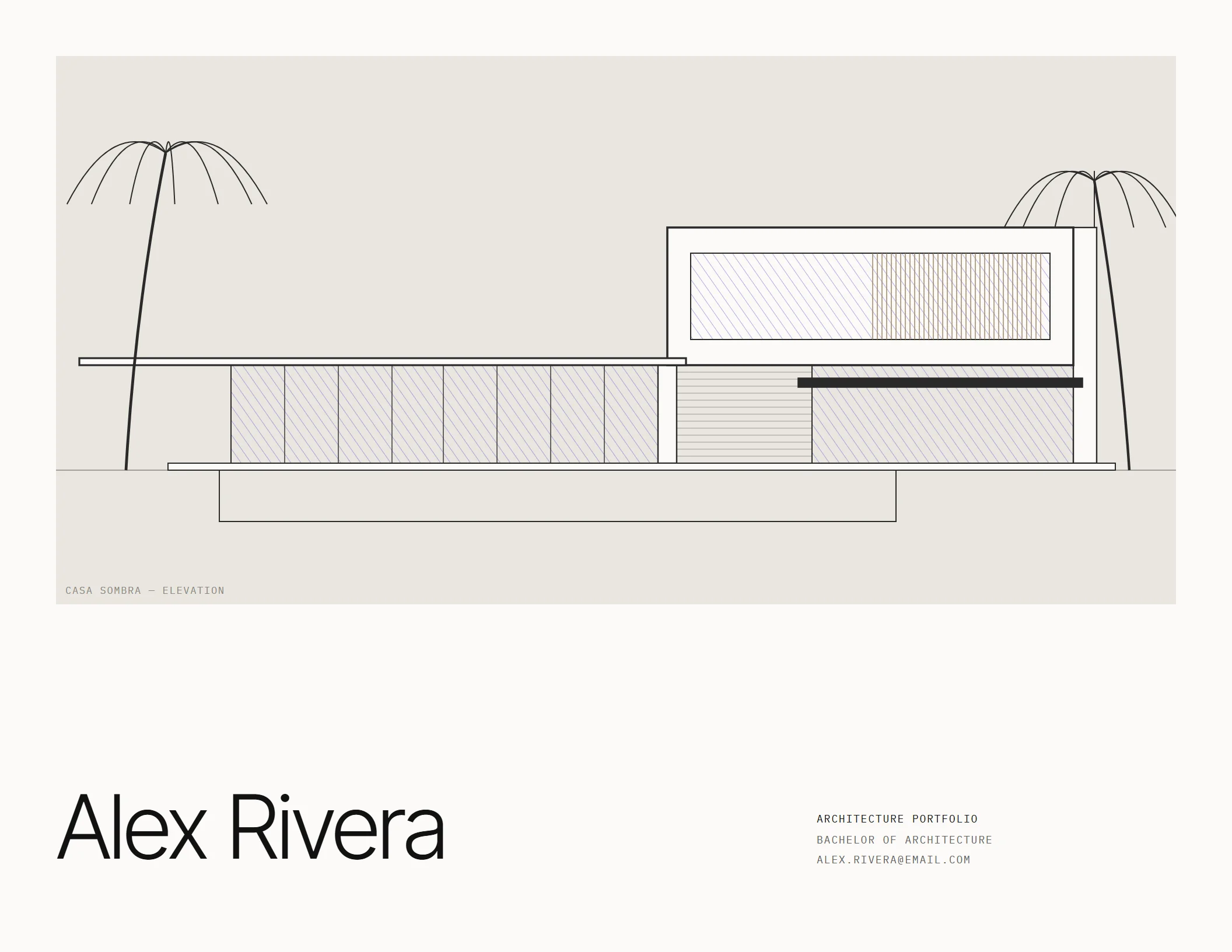
The Casa Sombra elevation occupies the upper part of the cover, with Alex's name below and small contact details alongside. You see the roof and screened volume before reading a project description. The lesson for your own cover is the hierarchy: one drawing with room around it, a name that is easy to find, and the supporting information kept together. Choose a drawing that introduces work you can explain on the following pages.
Pages 2 and 3: two project pages
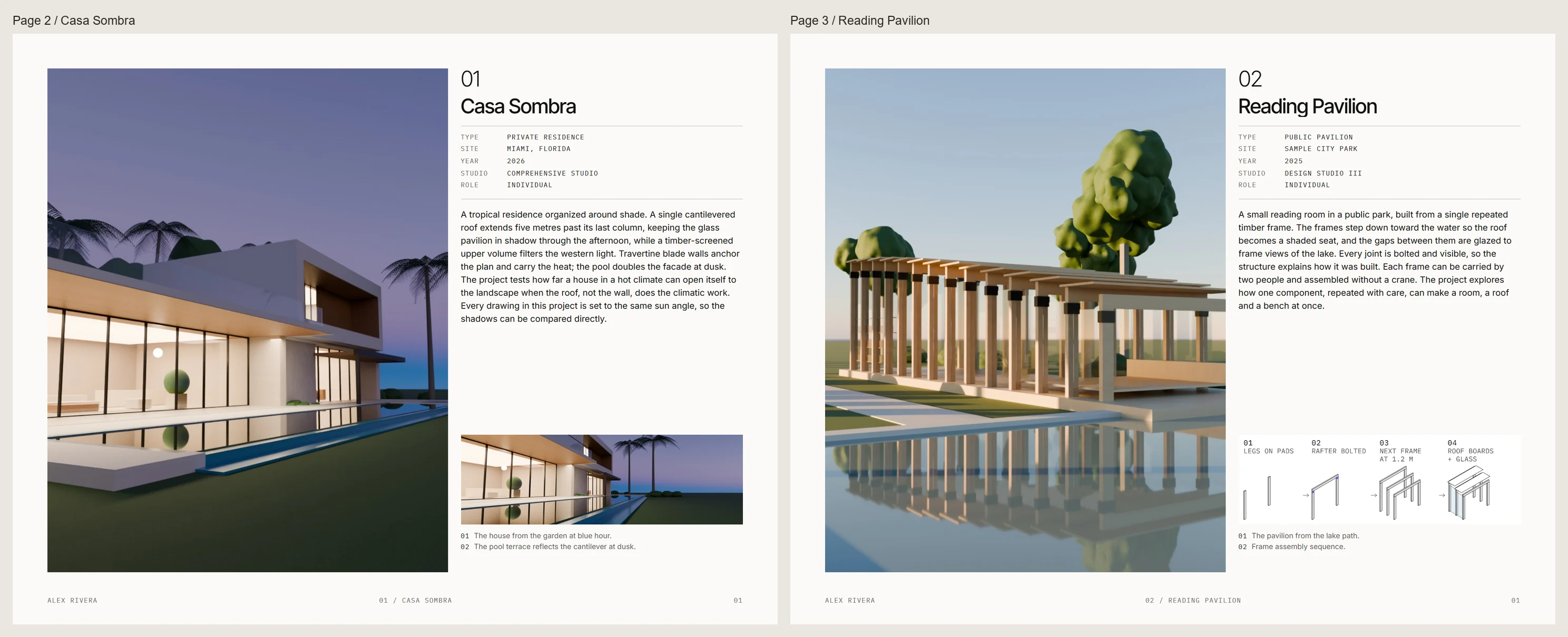
On page 2, Casa Sombra pairs a large garden view with a smaller pool terrace image. The title, facts and description sit in a separate column, so the reader gets the project context without reading across the render. Keep that separation between image and information on your own pages, and check the hero crop carefully so the roof remains visible.
Page 3 gives Reading Pavilion the same arrangement, replacing the secondary render with a frame assembly drawing. You can connect the repeated timber structure in the large view to the components in the strip below the text. The smaller image explains something the larger one raises, which is the relationship to aim for. Keep a more detailed construction explanation for a page with enough room.
Pages 4 and 5: housing and contact
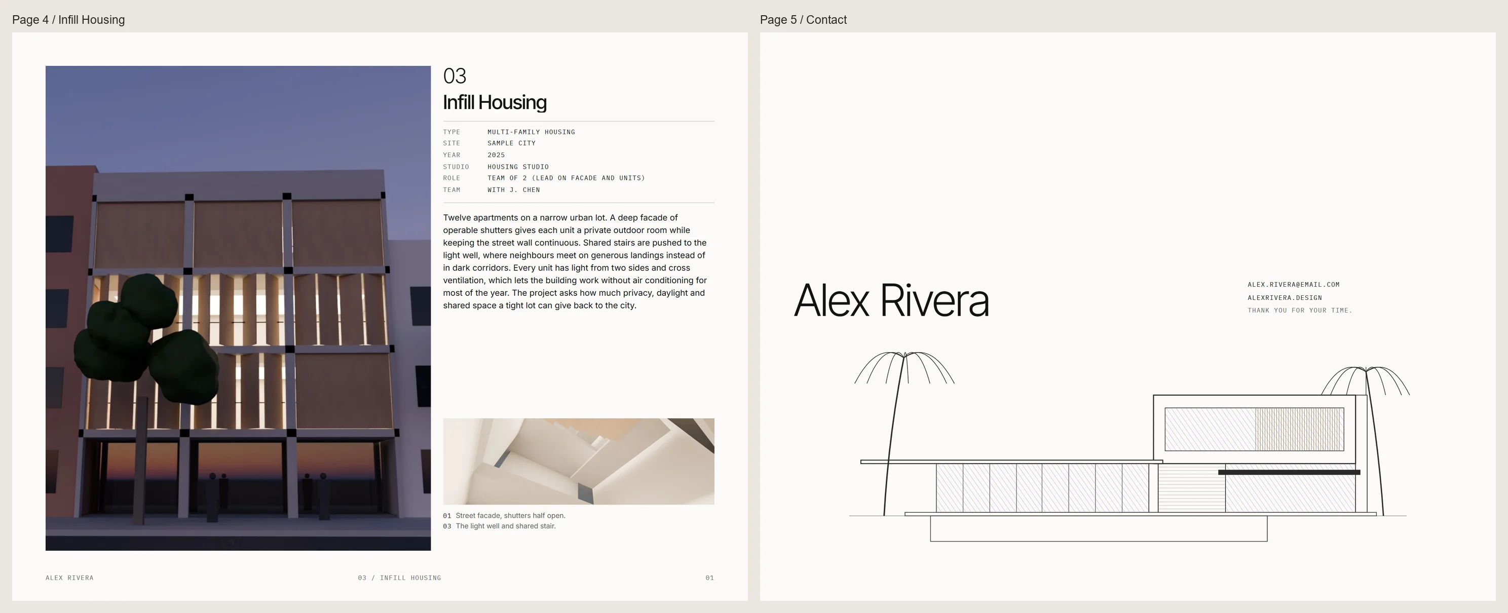
Infill Housing opens with its street facade and uses the smaller strip for the light well and shared stair. Its role and team entries separate Alex's contribution from the team's, and the viewpoint moves from the street into the shared interior. The unit plan appears later at a size where you can read it.
The contact page repeats Alex's name, email and website beside a small elevation. The file ends in the same drawing language it opened with, and the contact details sit in one group with enough space around them to find at a glance.
A ten-page core portfolio with three projects
Give your architecture portfolio more room when the reader needs to follow the design through drawings and images. This core keeps the same cover and contact page, adds an about/CV page, and expands each project. Casa Sombra gets the most space because its image and drawing pages support different parts of the explanation.
Read the sequence as: cover; about/CV; Casa Sombra opener, images and drawings; Reading Pavilion opener and drawings; Infill Housing opener and body; contact. That makes ten pages. You can see where each project starts without giving every project the same number of pages.
Open each project consistently
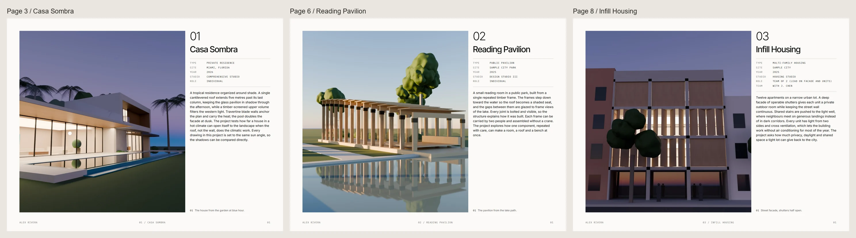
The three openers put a hero image across eight columns and information in the remaining four. Casa Sombra introduces the roof and glazed living space; Reading Pavilion introduces the repeated timber frames; Infill Housing introduces the street facade. You can change the subject while keeping the reading order stable.
Use the same facts order each time: type, site, year, studio, role and team where applicable. Keep the title short and the description within 80 to 120 words. Explain decisions visible in the adjacent image, then state what you contributed. For a professional architecture portfolio, this crediting becomes especially useful when your selected work involves several collaborators.
Alternate spatial views and drawings
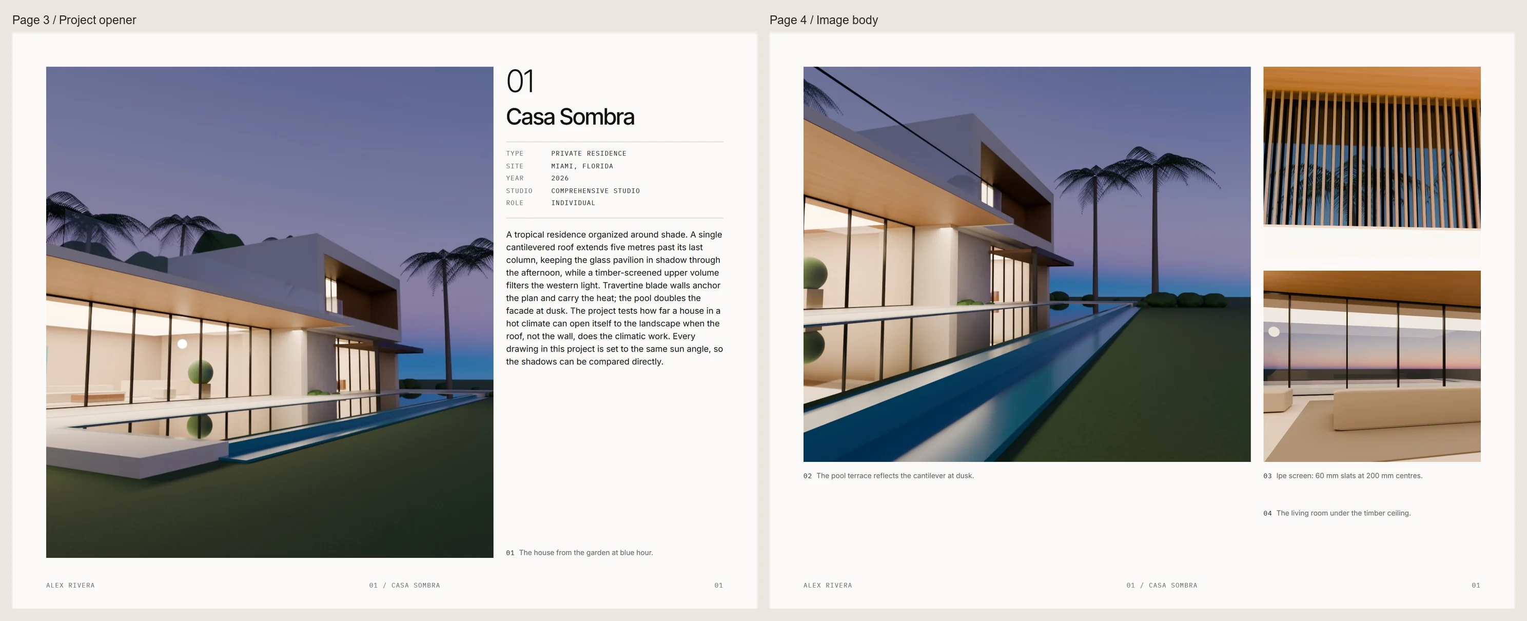
Casa Sombra moves from its opener to a large pool terrace view with smaller screen and interior views. The next page switches to the ground floor plan and cantilever section. You first understand the spaces, then examine how their arrangement and roof section support the description.
Reading Pavilion follows its exterior opener with a plan and section, bringing the repeated structure into focus. Infill Housing follows its facade opener with a unit plan, a light well render and a wall section. Choose each next page for what it explains. Avoid adding another render when a plan would answer the reader's next question more clearly.
Keep the about/CV page compact
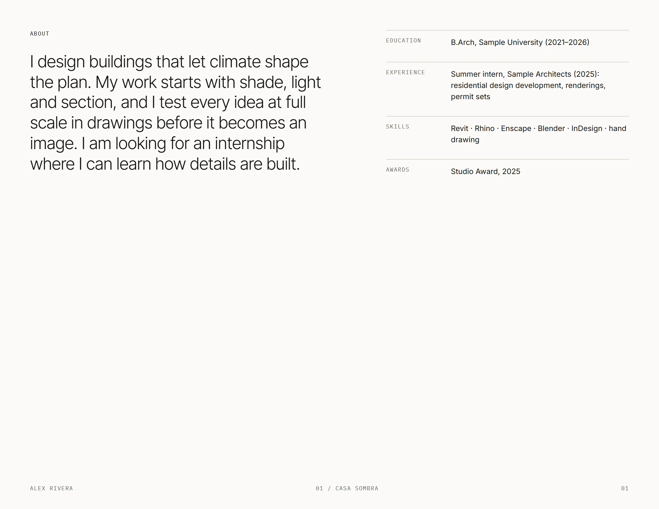
The about page puts Alex's statement on the left and four resume blocks on the right. You can read the interests in shade, light and section beside education, experience, skills and awards. Those interests connect to the projects that follow.
Write your own statement in 35 to 50 words and keep each resume block short. Use specific interests that your work supports. If a block is empty, remove it; preserve the space around the remaining information instead of filling it with general claims.
Light and dark editions, with three type directions
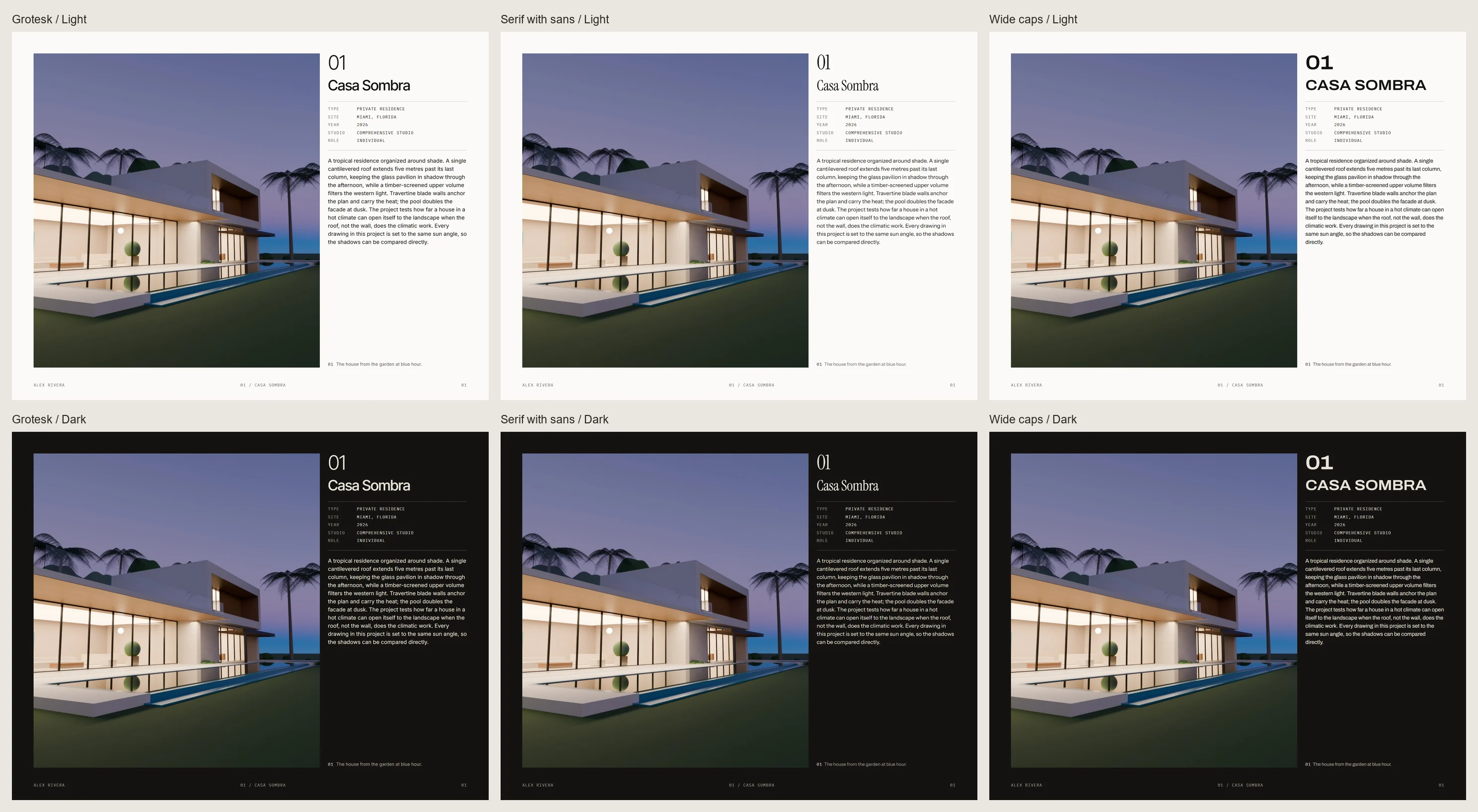
Compare the same Casa Sombra opener across all six panels. The light and dark editions keep the same frame geometry, so you can judge the color change without rearranging the project. Use light pages when you expect to print. Dark pages suit screen and PDF viewing, provided you check captions and drawing linework against the background.
The grotesk direction keeps the title close in character to the body text and suits a quiet, consistent hierarchy. Serif titles with sans text give the project heading a more editorial character. Wide caps make the title more emphatic and suit short project names; check longer titles before committing to that direction.
Choose one direction for the whole file. Keep monospace labels assigned to facts and small metadata. When you use dark pages, prepare drawing exports with light linework on dark or transparent backgrounds so a white sheet does not interrupt the page.
Drawing pages that read
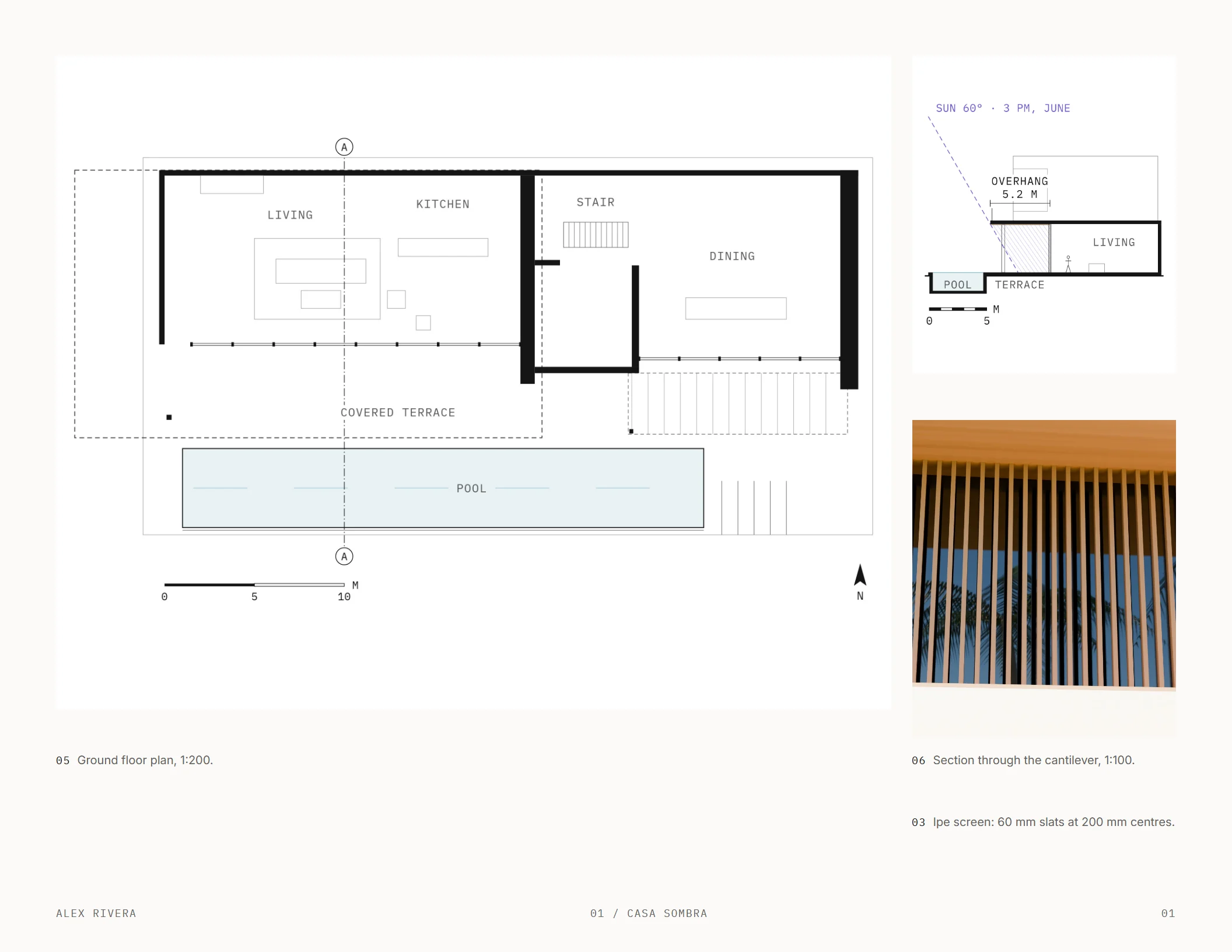
Casa Sombra gives its plan most of the page, with a cantilever section and screen view alongside. You can read room names, locate the section cut and connect the covered terrace to the pool. The plan includes a graphic scale bar and north arrow inside the image; the section has its own scale bar. Keep these with the drawing when you export it.
Use captions under 15 words, such as the sample's "Ground floor plan, 1:200." A stated ratio depends on the final printed size, so check it after resizing. The graphic bar remains useful when the image changes size on screen. Place captions close enough that their drawing association is clear.
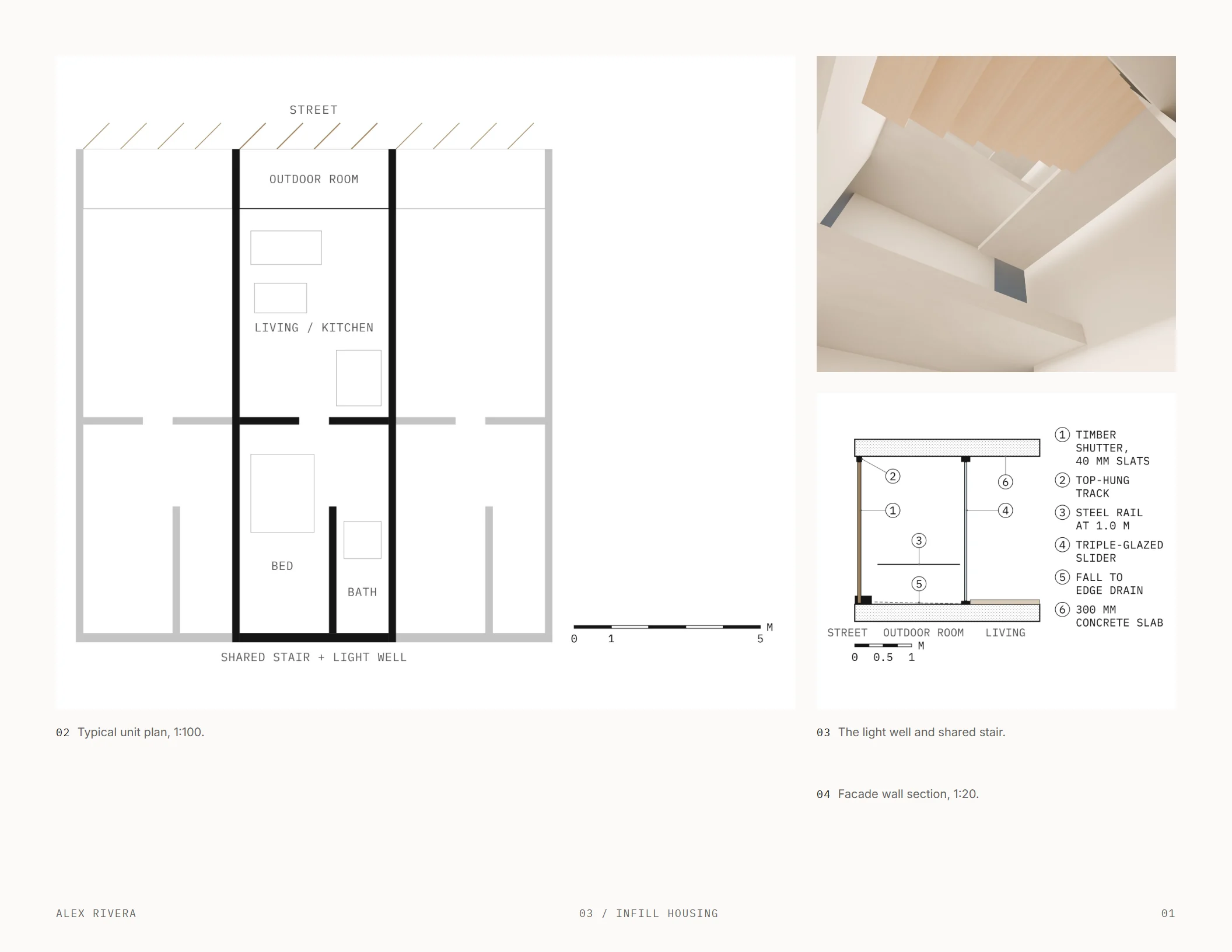
Infill Housing gives the typical unit plan a large frame beside the light well view and facade wall section. You can follow the plan from the outdoor room to the shared stair, while numbered section notes explain the facade assembly. Give a plan that much of the page when its labels need room. This plan has a scale bar; include a north arrow in your own plan export as well.
Check every page at its intended viewing size. The layout system sizes drawing text at least 7 pt and lines at least 0.25 pt at placement. Use those as checks on your exported sheet, keep drawings fitted whole, and remove detail before shrinking labels beyond readability.
What the strongest examples have in common
- Three selected projects. Show your best work, 3 to 5 projects at most; every extra page needs a reason.
- The same margins and alignments on every page, set on the layout guide's 12-column grid.
- One job per page: the cover introduces, an opener sets the context, a drawing page explains the proposal.
- Short descriptions and captions placed beside the work they discuss. Cut repeated text before reducing type size.
- Drawings that read as drawings, with labels, line weights and scale information intact at the final output size.
- An application PDF under 10 MB, checked page by page after export, contact page included.
The pages shown come from the Skiaform Portfolio architecture portfolio template for InDesign. Use the layout guide for the grid and page rules, and the web guide to carry the same projects into a website. Replace all fictional content with your own work and credits.
FAQ
How many pages should you include?
Prepare a 3 to 5 page work sample and a 10 to 14 page core portfolio. The examples here use five and ten pages respectively. Follow any page or file requirements supplied with an application.
How many projects should you show?
Choose 3 to 5 of your best projects for your portfolio. This sample uses three, giving the first more space for images and drawings. Keep the selection strong enough that you can explain every project and your contribution.
Can you copy a portfolio example?
You can borrow the page structure, information order and approach to captions from these fictional samples. Replace the projects, images, descriptions and personal details with your own. Credit collaborators accurately and obtain permission for work completed at a practice.
Should your work sample differ from the full portfolio?
Use the same page size, type and project information in both. The work sample condenses each project to a page, while the core adds separate openers and body pages. Keep those shared details synchronized when you update the work.
Should you choose landscape or portrait?
Use landscape for this system because it gives wide drawings room and suits screen viewing. Keep the orientation consistent between your work sample and core. If a submission requires portrait, rebuild the layouts around that page shape and check the drawings again.
Get the free portfolio checklist
A two-page checklist of the portfolio basics, from choosing projects to sending the PDF. It downloads as soon as you sign up. No spam.