Skiaform / Guides
Parti diagram: what it is and how to draw one
What a parti diagram is, how to draw one from your plan or section, and where it goes on a portfolio page, with four worked parti diagram examples.
A parti diagram shows your project's main organising idea in a few strokes. A reviewer can grasp the scheme from it before reading the plans: rooms held together by a courtyard, say, or a route through a row of repeated frames. If you've been asked to show your parti, find the relationship that organises your design and draw just enough to make it visible.
What is a parti?
The word comes from French and from the teaching tradition of the École des Beaux-Arts. In a project it names a decision about organisation. A style or a striking overall shape is not a parti on its own, because it doesn't say how the spaces are arranged.
Before drawing, try to describe yours in one short sentence. "Rooms arranged around a shared void" is something you can trace on a plan. "Warm and welcoming" is a mood, and it still needs a spatial decision before it can become a parti.
Parti, concept, bubble diagram and site analysis
A concept is the idea you explore in words or images, such as shelter, openness or a tie to a place. Developing it leads you toward a particular arrangement of space.
A bubble diagram comes earlier, before a plan exists. It tests which rooms belong together and which need separation while their shapes are still undecided.
Site analysis records the conditions you work with: orientation, access, the buildings around you. It explains the setting. Keep what you found on site separate from what you propose in response.
The parti describes the organising idea of the scheme you chose. Every mark in it should point to the same relationship in your plan or section, which is also how you check that the diagram explains the design you actually drew.
Common types of parti diagram
These are common ways of describing organisation, and many projects combine two, such as a linear route inside a courtyard arrangement. Use whichever description helps you read your own scheme.
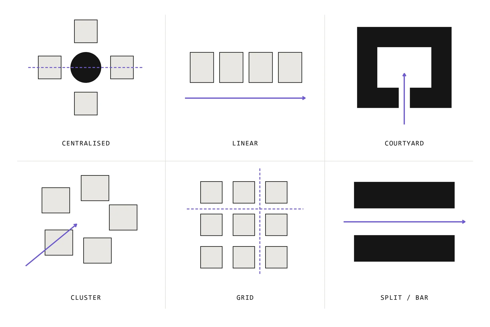
Centralised
Spaces gather around a dominant centre, often a shared room. The diagram shows how the surrounding spaces relate to it.
Linear
Spaces follow a line or axis. A long mass and one directional stroke are usually enough.
Courtyard
Masses surround an open space, and the void carries the idea. Filling it with detail hides the relationship you want to show.
Cluster
Smaller masses gather with space between them. Keep the gaps wide enough that the parts don't merge into one block.
Grid
Repeated lines or units set up an ordering system. Keep the repetition that organises the plan and leave out the detailed structural grid.
Split/bar
A bar is divided to make a gap, passage or relationship between its halves. Draw the split clearly enough that you can find the same space in your plan.
How to draw a parti diagram
Start from your current plan or section. The project figures below each follow three steps, from source drawing to simplified geometry to final parti.
Start from the drawing
Pick the view where the organising idea is easiest to see, trace the overall arrangement, and name the relationship you want to explain. Keep the source drawing next to you so you can check each reduction against the design.
Reduce to masses and direction
Remove furniture, labels and dimensions. Keep the main masses, the defining void or axis, and the main movement through the space. Keep a wall or edge only if it helps explain that relationship.
Keep the strokes that carry the idea
Give each diagram one idea and only a few line weights. Save a single accent colour for movement or light, and make sure every accent mark matches something in your drawings. If you can redraw the result quickly by hand and still recognise the organisation, it is reduced enough.
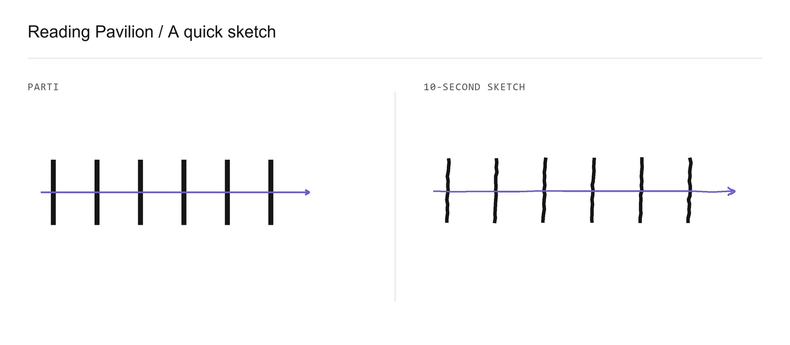
The Reading Pavilion figure shows that test: a clean parti beside a quick sketch version. The sketched strokes wobble, but the repetition and direction are the same.
Parti diagram examples
All four projects are fictional samples. Casa Sombra, Infill Housing and Reading Pavilion belong to Alex Rivera, a fictional architecture student; the Courtyard Guesthouse Interior belongs to Casey Linden, a fictional interior design student.
Casa Sombra
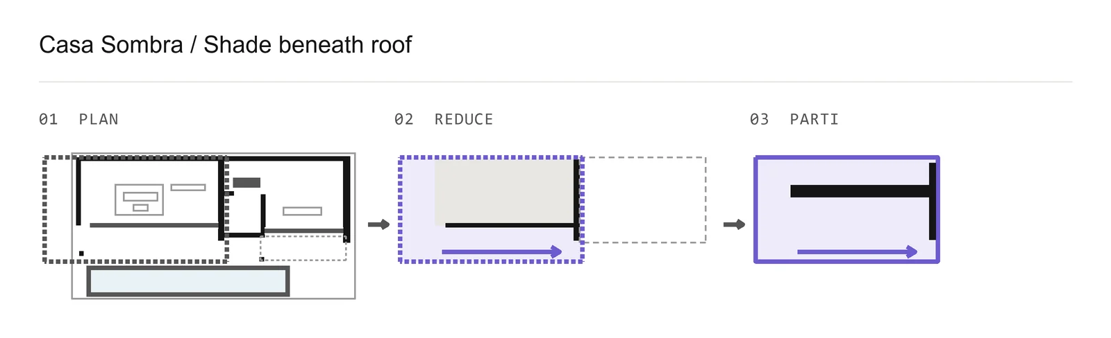
Follow the roof footprint and the edge of the living space through the reduction. The roof reaches past the glazing toward the terrace, and the final parti keeps only the shaded living space and terrace. The dining wing, pergola and pool drop out. The arrow runs along the covered terrace, parallel to the glazed edge of the living space.
Infill Housing
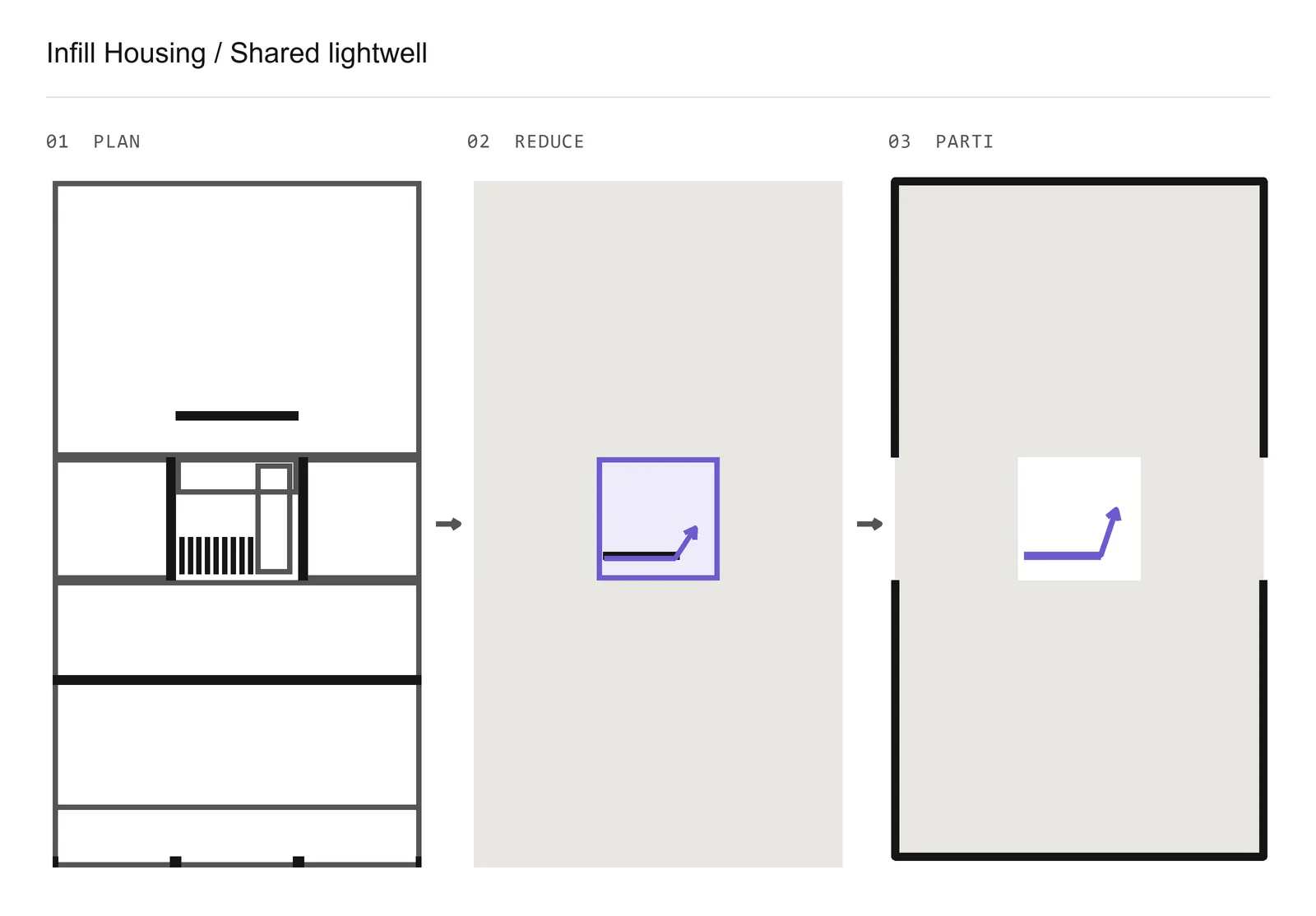
A long footprint wraps around a central lightwell. The final diagram keeps that void plus an accent stroke for the shared stair, which sits inside the lightwell zone. The short arrow follows the stair flight to its landing.
This diagram starts from the model's footprint, because the sample's drawn plan shows a typical upper-floor unit, not the whole building at ground level.
Reading Pavilion
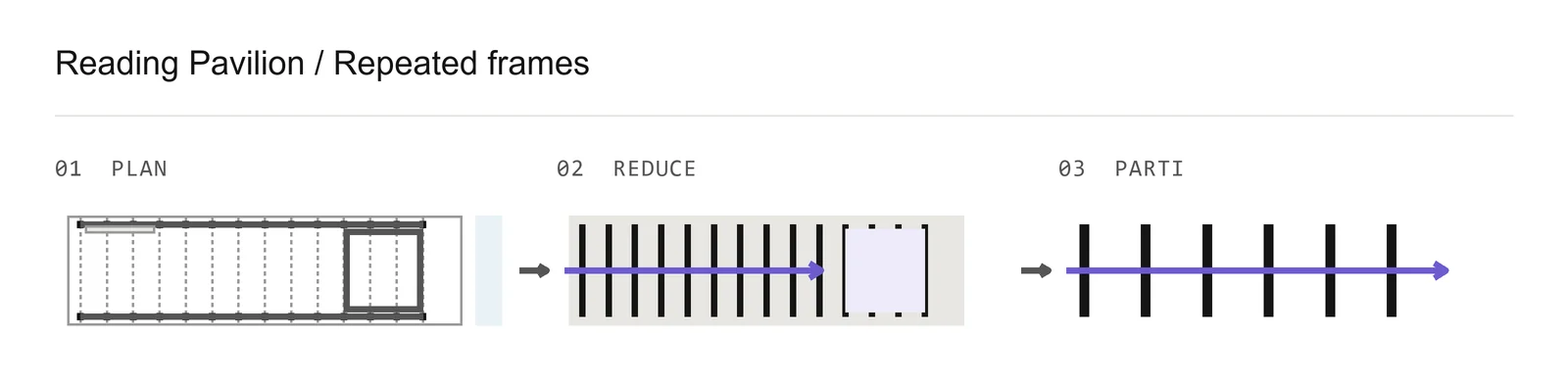
Here the idea is repetition and direction: transverse timber frames in a row, and the long axis toward the lake. The reduction keeps the bench zone at the lake end, with movement running along the room. The final arrow carries that direction on its own.
The six strokes are an abstract rhythm; the building itself has 14 portal frames. The section and model also show the frames stepping down toward the lake, a height change this plan diagram leaves out.
Courtyard Guesthouse Interior
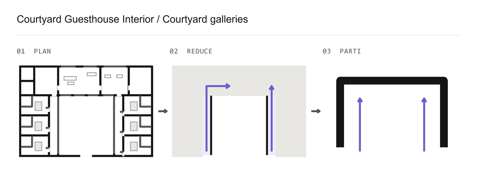
The existing building is a single-storey U: a public north wing, two wings of guest rooms and an open courtyard. The reduction keeps the glazed galleries along the courtyard, then the parti simplifies everything to a U and two gallery arrows pointing to the north wing. In the reduction, the west arrow turns toward the lounge through the connection by the lobby.
Parti diagrams in interior design
The same method works inside an existing shell. In the guesthouse, the U-shaped building and its courtyard galleries give you an organisation to trace before furniture or finishes come into it. An interior parti explains how the spaces connect within that shell.
Keep the existing boundary visible when it helps explain the proposal, then reduce the interior until the relationship between rooms and connecting spaces is all that's left.
A parti in section
Some projects are organised vertically. A stack of levels around a tall void, for example, reads better in a cut through the building than in plan. Reduce the section the same way, keeping the masses, the void and the direction that explain how the levels relate.
Place the parti beside the plan
Keep the parti small and put it next to the plan it explains, on the project's drawing page. On a presentation board, give it the same close relationship to the main drawing. Match its line style to your other drawings so the eye moves easily between them.
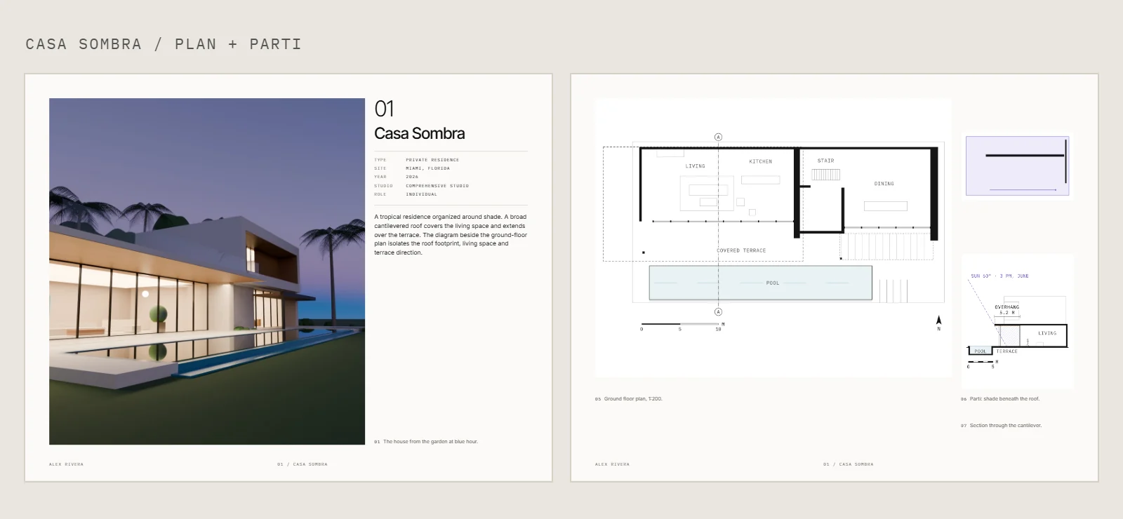
In this Casa Sombra mock-up, the large plan sits beside the parti, with the roof section below. Placed that close, the diagram is easy to check against the plan. The architecture portfolio layout guide covers page arrangement, and the architecture portfolio examples show more pages to compare.
Common mistakes
- Too much detail. If you can read partitions and fixtures, reduce the drawing again.
- Several ideas in one diagram. When the marks compete, split them into separate diagrams.
- A diagram that doesn't match the plans. Check every mass, gap and direction you kept against the source drawing.
- Decorative arrows. Remove any arrow whose direction you can't explain through the space.
- A parti added after the fact. If the design doesn't follow it, redraw the diagram to match the scheme you have.
The Skiaform Portfolio architecture portfolio template for InDesign has drawing pages with a side frame sized for a diagram like this, and it also comes in an interior design edition. The free portfolio checklist helps while you assemble the pages.
FAQ
What is a parti diagram in architecture?
It's a simplified drawing of a project's main organising idea. Masses, voids and directional marks show a relationship you can also find in the plan or section.
What is the difference between a parti and a concept?
A concept is an idea expressed in words or images. The parti is the spatial organisation of the scheme you chose while developing that idea.
Does a parti have to be drawn in plan?
No. When the organising relationship is vertical, a section shows it better. Pick whichever view makes the relationship easiest to read, and reduce it as far as you would a plan.
How many parti diagrams should a project have?
Start with one for the main organising idea. Add a second only when a distinct relationship needs its own view, and keep each diagram readable on its own.
Can I draw a parti diagram digitally?
Yes. Digital or by hand, the process is the same: simplify the source drawing, then check the result at the size it will appear on the page. If you could redraw it by hand in a few strokes, it is simple enough.
Get the free portfolio checklist
A two-page checklist of the portfolio basics, from choosing projects to sending the PDF. It downloads as soon as you sign up. No spam.